How to design an effective dashboard
A dashboard is a powerful tool for data visualization and analysis, but only if it is designed effectively. An effective dashboard must be intuitive, informative, and actionable.
The first step in designing an effective dashboard is to understand the data that will be displayed. What are the most important metrics? What trends need to be monitored? What is the goal of the dashboard?
Once the data has been analyzed, it can be organized into logical groups and displayed in a way that is easy to understand.
Next, the dashboard must be designed for interactivity. The user should be able to drill down into the data to get more details, or switch between different views to see the data from different angles.

So, here are 7 steps we should keep in mind while designing a dashboard to make it effective:
- Identify the purpose of the dashboard. What information do you want to communicate?
- Select the right data. Choose measures that are important and relevant to the purpose of the dashboard.
- Choose an an appropriate layout
- Provide interactivity. Allow users to interact with the data in order to further understand it.
- Make it mobile-friendly. Design the dashboard in a way that is accessible on mobile devices.
- Test and iterate. Test the dashboard with users and make changes as needed.
These are the steps, now you can leave, but don’t, I will go into details for each one of them.
Identify the purpose of the dashboard
A dashboard is a graphical display of information that is typically used to provide an overview of a particular area or system. In many cases, dashboards are used to monitor key performance indicators (KPIs) or to track progress against specific goals.
When trying to identify the purpose of a dashboard, it is important to consider the context in which it is being used. For example, is the dashboard being used by an individual, a team, or an entire organization? Is it being used to track KPIs or goals for a specific project or initiative, or is it meant to provide a general overview of an area or system?
Once the context has been considered, it should be relatively easy to identify the purpose of the dashboard.
If the dashboard is being used by an individual, it is likely that the purpose is to help that person track their own performance or progress against specific goals.
If the dashboard is being used by a team, the purpose is likely to be similar, but may also include tracking team KPIs or goals.
For an organization-wide dashboard, the purpose is likely to be providing an overview of an area or system, or tracking organizational KPIs or goals.

Select the right data
When it comes to creating a dashboard, one of the most important things to consider is what data to include. This can be a tricky task, as there are often many different factors to consider.
However, there are a few general tips that can help you select the right data for your dashboard.

First, consider what goals you want to achieve with your dashboard. What do you want your users to be able to do? What information do they need to be able to do it? Make sure that the data you select is relevant to these goals.
Second, consider the different types of data that are available. There are many different types of data that can be used in a dashboard, so it’s important to think about which ones will be most useful to your users. Do you need real-time data? Historical data? Aggregated data?
Third, think about how you want to present the data. Dashboards can be customized to show data in many different ways. Do you want to use charts, graphs, or tables? Do you want to be able to filter or sort the data? Do you want to include interactive features?
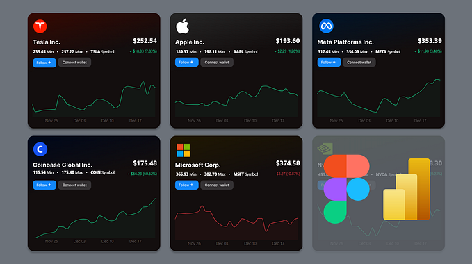
Choose an appropriate layout
Most businesses have a wealth of data that they can use to make better decisions. But without the right layout, that data can be tough to interpret.
A well-designed dashboard layout puts the most important information front and center, so you can quickly and easily see what’s going on. Here are a few tips for choosing the right layout for your dashboard:

- Keep it simple — The dashboard should be easy to understand at a glance. That means using clear and concise labels, and avoiding clutter.
- Highlight what’s important — Use colors, icons, and other visuals to call out important data points. This will help you quickly see what needs your attention.
- Group similar information — Organize your dashboard into sections so related information is grouped together. This will make the data easier to interpret.
- Use white space — Don’t be afraid to use empty space on your dashboard. This can actually help to highlight important information.
- Consider the user — Think about who will be using the dashboard, and design it accordingly. Make sure the layout is intuitive and easy to use.
By following these tips, you can create a dashboard layout that is both effective and easy to use.
Provide interactivity
Most people want their data visualizations to be interactive. That way, they can explore the data in different ways, and find the stories that matter to them.
There are a few different ways to add interactivity to a dashboard. Here are a few of the most popular methods:

- Tooltips — Tooltips are small pop-up windows that appear when you hover over an element on a dashboard. They’re a great way to provide additional information about a data point without cluttering up the visualization.
- Filters — Filters let users select which data they want to see. For example, you could add a filter to a bar chart that lets users select which data series they want to see.
- Drill-downs — Drill-downs let users “drill down” into a data set to see more detailed information. For example, you could add a drill-down to a map that lets users see data for a specific region.
- Slicers — Slicers let users select a subset of data to view. For example, you could add a slicer to a pivot table that lets users select which columns they want to see.
- Parameters — Parameters let users control the data that’s being used in a visualization. For example, you could add a parameter to a line chart that lets users select the date range they want to see.
- Actions — Actions let users perform tasks with the data on a dashboard. For example, you could add an action to a table that lets users export the data to Excel.
- Animations — Animations can add a bit of flair to a dashboard and help tell a story with the data. For example, you could add an animation to a line chart that shows how a data series has changed over time.
- Custom JavaScript — If you’re comfortable with coding, you can use custom JavaScript to add just about any type of interactivity to a dashboard. For example, you could use JavaScript to create a custom tooltip that displays more information about a data point. Which method you use will depend on your goals for the dashboard and the skills of your team.
But no matter which method you choose, adding interactivity to a dashboard can help your users find the stories in their data.
Make it mobile-friendly
A mobile friendly dashboard is one that is easily accessible and viewable on a mobile device. This can be achieved in a number of ways, but some key considerations include:
- Use responsive design principles to ensure the dashboard can be viewed on a range of screen sizes
- Optimize images and other media for fast loading on mobile networks — Use touch-friendly elements and controls for easy interaction on smaller screens
- Limit the use of data-heavy charts and graphs to avoid overwhelming users
With more and more people accessing the internet from mobile devices, it’s important to make sure your dashboard is mobile friendly. By following the tips above, you can ensure your dashboard is accessible and user-friendly for all your mobile visitors.

Test & Iterate
Dashboards are a popular way to display information, whether it’s data from an analytics tool, social media activity, or sales figures.
But designing a dashboard that’s effective can be challenging, especially if you’re not sure how users will interact with it. That’s where user testing comes in.
By testing your dashboard design with actual users, you can get feedback on what works and what doesn’t. Here’s how to set up a user test for your dashboard design:
- Define your goals — Before you start testing, it’s important to have a clear idea of what you want to learn from the user tests. Do you want to know if users can find the information they need? Are you trying to figure out the best way to display the data? Defining your goals upfront will help you structure the user test and know what to look for in the results.
- Choose your users — Your next step is to choose who you’ll be testing the dashboard with. If you have a specific target audience in mind, try to find users who fit that profile. You can also test with different types of users, such as power users who are familiar with the data, or new users who are seeing the dashboard for the first time.
- Set up the test — Now it’s time to set up the user test itself. You’ll need to prepare the dashboard design, as well as any instructions or materials the users will need. If you’re testing a live dashboard, you can give users a URL to access it. If you’re testing a prototype, you can use a tool like Invision, Marvel or even Protopie if you want to take it to next level.
- Run the test — Once everything is ready, it’s time to run the user test. Depending on the size of your test group, you can do this in one session or break it up into multiple sessions. As users interact with the dashboard, you’ll want to take note of any problems they have or areas where they get stuck. You can also ask them questions about their experience after they’ve finished using the dashboard.
- Analyze the results — After the user test is complete, it’s time to analyze the results. Look for any patterns in the feedback you received and use it to improve your dashboard design. Testing your dashboard design with users is a valuable way to get feedback and make sure your design is effective. By following these steps, you can set up a user test that will help you create a better dashboard for your users.

Thank you so much for taking the time to read my story. It means a lot to me that you would give up your valuable time to read something I wrote. I really appreciate it!